Application Distribution
Each application distribution must define its own parameters, that is to say parameters are dedicated to a Distribution of the Bathroom Application.
The parameters are written in a JSON object.
↗ Open a sample of a complete JSON object 🔗 with all the parameters.
❗ The JSON object cannot contain any comment.
JSON Schema
Description
JSON schema is a specification that can offer descriptions, validation, code completion and more, while editing a JSON file in a compatible text editor. You can find a non-exhausive list of compatible editors here. We recommend using VSCode.
For the application distribution settings file, we offer a JSON schema that simplifies a lot its edition, and reduces potential errors to the minimum. The Bathroom development team ensures that the JSON schema is always up-to-date.
Our JSON schema contains a short description for all of the supported settings, so for most of them you don't need to check the documentation on the current page to understand their purpose. For complex settings or if you need to see examples, the current documentation offers more information.
How to use
To use our JSON schema, you just have to add this line in your application distribution settings file:
{
   "$schema": "https://bathroom.enterprise.by.me/Bathroom/assets/appSettingsSchema.json"
}
Once the line is added as part of the JSON itself, you editor should start directly to use the schema to underline wrong fields, offer code completion, description, etc.
Note: this line is only useful during the edition process. Once your settings file is ready, you can remove it before updating your settings. However it has no impact if you leave it in the settings (so that you don't have to re-add it next time for example).
Supported settings
| For... | See... |
|---|---|
| Language, Units and Currency | locale, locales |
| Frame | allowMeasureService, allowSharing, hideProceed, textualFieldAvailable, allowDelivery, allowGuidedTour, allowInstallation, allowFrontEdge, summaryModules,standardModules, allowAdditionalHelp, enableFavorites, hideItemList, hidePrint |
| Default Project | defaultProject, defaultWallMaterialID, defaultFloorMaterialID, plan2DAvailable |
| Catalog | catalogEntries, searchSortLocale |
| Style | defaultStyle |
| Property Panel | propertiesPanelOptions, commercialDimensionParameter, aggregationsParameter |
| Worktop | defaultWorktopOverhang, resetCustomizedLinear, waterfallInset |
| Wallpanel | resetCustomizedLinear |
| Pricing | pricingOptions, financeOptions |
| Rendering | hqRendering, hidePanoramicRendering |
| Editors | hideComposeProduct, hideComposeProductPrice |
locale
Optional parameter – Value type: string
Name of the default locale for this Application Distribution. It must match the name of one of the defined available locales. Example: "en-US" The currency is inferred from the locales used in the application.
📌 If not set, the first locale specified in the list of available locales is used.
locales
This parameter contains the list of available locales for the Application Distribution. It must contain at least one element.
Mandatory parameter– Value type: list of local objects.
Object defining a set of regional parameters, can contain the keys / pairs below.
name
Mandatory key – Value type: string.
A combination of a mandatory and an optional element joined in a string and separated by a "-" (dash).
- MANDATORY: 2-letter code of a language, following 🔗 ISO 639-1.
- OPTIONAL: 2-letter code of a region / country, following 🔗 ISO 3166-1. Examples: "da-DK" for "Danish-Danemark" or "fr-FR" for "French-France".
fallback
Optional key – Value type: string
Used for translations only. If a translation key is not found for the given locale, the translation system falls back to this locale instead. If not specified, falls back to English.
unitSystem
Mandatory key – Value type: string.
Defines which unit system is used in the application. Valid values are:
- "metrics"
- "imperial"
lengthUnit
Mandatory parameter – Value type: string
Defines the base unit for length in the application. Valid values are:
- "millimeter"
- "centimeter"
- "decimeter"
- "meter"
- "inch"
- "foot"
- "yard"
lengthPrecision
Mandatory parameter – Value type: integer
The various lengths displayed in the application will be displayed with lengthPrecision decimal digits.
lengthFractionPrecision
Mandatory if "imperial" – Value type: integer
Used only when the value of unitSystem is "imperial".
lengthFractionPrecision is the minimal fraction of lengthUnit.
Valid values are: "8", "16" or "32".
Example 1 – Array of three locales with metrics
{
    "locales":
    [
        {
            "name": "fr-BE",
            "unitSystem": "metrics",
            "lengthUnit": "millimeter",
            "lengthPrecision": 0,
            "fallback": "en"
        },
        {
            "name": "nl-BE",
            "unitSystem": "metrics",
            "lengthUnit": "millimeter",
            "lengthPrecision": 0,
            "fallback": "en"
        },
        {
            "name": "de-DE",
            "unitSystem": "metrics",
            "lengthUnit": "millimeter",
            "lengthPrecision": 0,
            "fallback": "en"
        }
    ]
}
Example 2 – Array of two locales with imperial
{
    "locales":
    [
        {
            "name": "en-US",
            "unitSystem": "imperial",
            "lengthUnit": "foot",
            "lengthPrecision": 0,
            "lengthFractionPrecision": 16,
            "fallback": "en"
        },
        {
            "name": "es-US",
            "unitSystem": "imperial",
            "lengthUnit": "foot",
            "lengthPrecision": 0,
            "lengthFractionPrecision": 16,
            "fallback": "en"
        }
    ]
}
pricingOptions
The pricingOptions object can contain the keys / pairs below.
priceTopAssembly
Optional key – Value type: boolean
The default value is "false".
Indicates whether the assembly product prices should include the price of the top assembly or not.
This only affects assembly products (i.e. BMA products), single component products (i.e. BM3 products) are always priced with their own price.
hideAssemblyProductCardPrice
Optional key – Value type: boolean
The default value is "false".
Set to true if you want to hide the product prices that are displayed in the different catalog browsers in the planner.
It only affects assembly products (i.e. BMA products).
Even if set to true, the price of the products that are not assemblies will be displayed in the catalog browser.
hideNonAssemblyProductCardPrice
Optional key – Value type: boolean
The default value is "false".
Set to true if you want to hide the product prices that are displayed in the different catalog browsers in the planner.
It only affects non assembly products (i.e. BM3 products).
Even if set to true, the price of the products that are assemblies (i.e. single component products corresponding to BMA files) will be displayed in the catalog browser (worktops, accessories, etc.).
linearPrecision
Optional key – Value type: number
The default value is "3".
Defines the decimal precision for linear lengths in the BOM. Depending on the chosen pricing method, the 'linear' or 'square' value will be expressed in m (linearMeter), ft (linearFeet), m² (squareMeter), dm (linearDecimeter) or ft² (squareFeet).
For example, if linearPrecision is set to "3" and a product is priced in linearMeter, the BOM linear attribute will be: 1.355.
In other terms, it will be precise to the millimeter (meter * 10 power to -3).
Note:
- The
linearPrecisionparameter is only used for the four pricing methods listed above.- A value rounding will be necessary if you set a number lower than "3". The
roundingMethodattribute is used to control-how to perform this rounding.
coefficient
Optional key – Value type: number
The default value is "1".
Defines a coefficient that is multiplied to every prices in the application. For exemple, it allows for a particular app-distribution to have every prices down by 10% (in this case, coefficient would need to be 0.9).
useExternalPriceEngine
Optional key – Value type: boolean
The default value is "false".
Set to true if you want to use an external module to compute the bathroom price. By choosing this option, after each BOM computation, the planner sends it via an iframe message 🔗 and waits for a reply that must contain the bathroom price to display in the UI.
Note: this option is not compatible with the
financeOptionssetting below. Using both will result in undefined behaviors in the planner.
Example
"pricingOptions":
   {
      "priceTopAssembly": true,
      "hideAssemblyProductCardPrice": true,
      "hideNonAssemblyProductCardPrice": true,
      "linearPrecision": 3,
      "coefficient": 1,
      "useExternalPriceEngine": false
   },
financeOptions
The financeOptions object is used to configure the monthly price of bathroom projects. If you don't need this feature, you can omit this object as it is optional. If you want to enable this option, you can provide the keys / pairs below.
durations
Mandatory key – Value type: Array<integer>
Indicates the list of accepted loan durations, expressed in months. Values are integer comprised between 2 and 120 (10 years). Values outside this range will be clamped (i.e. below 2 it will be 2 and over 120 it will be 120). Note: if this array is empty, the entire finance feature will not be active.
defaultDuration
Optional key – Value type: integer
The default value is the first value of the durations array.
Defines the default duration of the loan (the first proposed duration). If given, it must be a value comprised in the durations array.
interestPercentage
Optional key – Value type: number
The default value is 0.1. Defines the interest rate of the loan (APR) in percentage. It must be between 0.1 and 100 and the value is clamped if outside this range.
depositPercentage
Optional key – Value type: number
The default value is 0. Defines the deposit percentage of the loan (i.e. the percentage of the total price that will have to be payed directly during the sale). It must be between 0 and 100 and the value is clamped if outside this range.
Example
"financeOptions":
   {
      "durations": [ 3, 6, 12, 36, 48 ],
      "defaultDuration": 6,
      "interestPercentage": 2.6,
      "depositPercentage": 10.5
   },
defaultStyle
This object is used to define the default styling for the furniture in the Kitchen application. Note that it is possible to overwrite this style through iFrame Messages References.
First, you have to define a styleVersion key that tells the planner in which version it should read the style from the iFrame message. If styleVersion is not specified, it will use version 0 to keep backward compatibility.
defaultStyle
 |__ styleVersion
 |__ linearStyle (object)
 |     |__ plinth (string)
 |     |__ cornice (string)
 |     |__ worktop (string)
 |     |__ decostrip (string)
 |     |__ wallPanel (string)
 |     |__ wallEdgeStrip
 |__ furnitureStyle (object)
 |     |__ handle (array)
 |     |__ drawerFront (array)
 |     |__ front (array)
 |__ floorStyle (object)
 |     |__ front (string)
 |__ wallStyle (object)
 |     |__ front (string)
 |
 |__ ignoredParameters (array of strings)
Below are the supported style versions and their detailed data structure.
styleVersion = 0
In version 0, the Kitchen style is a finite list of elements that you can define for styling. All these elements must be specified at the root of the object. The exhaustive list of supported style parameters is the following (⚠ match the case):
| Style parameters for linears | Style parameters for non-linears |
|---|---|
| worktopID | handleID |
| plinthID | frontID |
| wallPanelID | drawerFrontID |
| wallEdgeStripID | legID |
| corniceID | fillerFrontID |
| decostripID | leftCoverPanelID |
| rightCoverPanelID | |
| topCoverPanelID | |
| backCoverPanelID |
styleVersion = 1
In version 1, the Kitchen style is dynamic for product parameters. You can add four keys at the root of the object:
- linearStyle: Will contain linear style; the only supported keys are:
- "worktop"
- "plinth"
- "wallPanel"
- "wallEdgeStrip"
- "cornice"
- "decostrip"
- furnitureStyle: Affects every products in the planner; will contain any parameter name.
- floorStyle: Affects every products that touch the floor; will contain any parameter name.
- wallStyle: Affects every products that do not touch the floor; will contain any parameter name.
The tree last objects (furnitureStyle, floorStyle and wallStyle) will contain any parameter name. For example:
- "handle"
- "drawerFront"
- "glassFront"
- "corniceOption",
- etc.
Listed parameters can be of any valid parameter type (boolean, integer, product, etc.), not necessarily product type.
The value associated with each parameter must be an array of accepted values. The order matters because the first values will be applied first if possible.
Note: The parameter names are case sensitive.
styleVersion = 2
This version adds the support of the attribute ignoredParameters that can be used to blacklist some parameter names. These parameters will never be added to the global style when planning your bathroom.
The possible keys are the following:
styleVersion
Optional key – Value type: positive integer
Version in which to read the rest of the object. Default to 0 if not specified.
linearStyle
Optional key – Value type: object
Object in which you can provide the linear style (see above the keys for styleOption =1). Keys are linear names, values are a single DBID as a string. Is taken into account only if styleversion >= 1.
furnitureStyle
Optional key – Value type: object
Object in which you can provide the furniture style (see above the keys for styleOption =1). Keys are parameter names, values are arrays of accepted values. Is taken into account only if styleversion >= 1.
floorStyle
Optional key – Value type: object
Object in which you can provide the furniture style for furniture that touch the floor (see above the keys for styleOption =1). Keys are parameter names, values are arrays of accepted values. Is taken into account only if styleversion >= 1.
wallStyle
Optionalkey – Value type: object
Object in which you can provide the furniture style for furniture that do not touch the floor (see above the keys for styleOption =1). Keys are parameter names, values are arrays of accepted values. Is taken into account only if styleversion >= 1.
ignoredParameters
Optional key – Value type: array of strings
An array of parameter names as strings. All listed parameters will not be added to the dynamic global style when planning your bathroom. Is taken into account only if styleversion >= 2.
Other Parameters
handleID, frontID, drawerFrontID, plinthID, legID, fillerFrontID, wallPanelID, wallEdgeStripID, corniceID, decostripID and worktopID Optional keys – Value types: string Default DBID for each parameter. Values are a single DBID as a string. Is taken into account only if styleVersion = 0
Example
 "defaultStyle": {
      "styleVersion": 2,
      "linearStyle": {
         "plinth": "13950",
         "cornice": "14178",
         "worktop": "14130",
         "decostrip": "14146",
         "wallPanel": "18510",
         "wallEdgeStrip": "14173"
      },
      "furnitureStyle": {
         "handle": [ "13776" ],
         "drawerFront": [ "13700" ],
         "front": [ "13855" ]
      },
      "floorStyle": {
         "front": [ "13855" , "13902" ]
      },
      "wallStyle": {
         "front": [ "13699" , "16059" ]
      },
      "ignoredParameters": [ "cooktop", "leftSidePanel", "rightSidePanel" ]
   },
propertiesPanelOptions
This object defines how to display the properties of a product depending on the context (the first definition level of the object) and the type.
The data structure of the propertiesPanelOptions object is the following.
propertiesPanelOptions
|____ DetailedDesignState (array)
|           |__ types (array of strings)
|           |__ presentation
|           |     |__ parameter 1
|           |     |      |__ parameter
|           |     |__ parameter 2
|           |     |      |__ parameter 1
|           |     |      |__ parameter2
|           |     |__ parameter 3
|           |     |      |__ parameter 1
|           |     |      |__ parameter 2
|           |     |      |__ parameter 3
|           |     |__ parameter 4
|           |     |__ parameter 5
|____ CabinetComposer (array)
|           |__ types [536]
|           |__ presentation
|           |     |__ parameter 1
|           |     |      |__ parameter
|           |     |__ parameter 2
The object can contain the keys / pairs below.
DetailedDesignState
Optional key – Value type: array
Use types to define the way the properties will be displayed in the bathroom application, in the context of a detailed design.
CabinetComposer
Optional key – Value type: array
Use types to define the way the properties will be displayed in the bathroom application, in the context of the cabinet composer.
Each property presentation is represented by the following objects.
types
Mandatory key – Value type: array of integers
An array of closed tag IDs. If empty, it means that this presentation is for all type of products (closed tag type) that do not have a more specific presentation defined. If not empty, this presentation will represent all products matching one of the closed tags in the list.
presentation
Mandatory key – Value type: object
Define the list of parameters in the right order.
Each presentation contains the following kind of properties:
- groups – array – Optional. In this array you will define grouping of parameters. :soon: Available soon.
- parameters – array – Mandatory. This array is made of objects that define a parameter and its possible sub-options. The property panel in the planner will use the order that you define in this array. If a parameter in a product is visible but does not appear in parameters or groups array, it will be display after all parameters define by those list.
General Example
{
    "types": [],
    "presentation": {
        "parameters": [{
            "id": "front",
            "parameters": [{
                "id": "side"
            }]
        },
        {
            "id": "drawerFront"
        }]
    }
}
In this example, you have a defined presentation that works for any type of product. In this presentation, there are two main parameters that we want to show first.
- The first one is the parameter front and it has one sub-option, if the product has the parameter side.
- The second one is the parameter drawerFront. Other parameters will be shown afterwards.
Detailed Example 1 – No type, no sub-option
This example shows the way the properties are ordered, regardless of the type, at step 3.
In this example, the parameters front, drawerFront and handle will be presented first (if they exist in the selected product). Their position in the array determines their order in the Properties panel.
{
   "propertiesPanelOptions": {
      "DetailedDesignState": [
         {
            "types": [],
            "presentation": {
               "parameters": [
                  {
                     "id": "front"
                  },
                  {
                     "id": "drawerFront"
                  },
                  {
                     "id": "handle"
                  }
               ]
            }
         }
      ]
   }
}
Detailed Example 2 &"8211; No type, but a sub-option This example shows the way the properties are displayed, regarless of the type, at step 3. In this example, some parameters in the array have a sub-option. If the product selected in the planner has this option and its sub-option, the Properties panel will display the sub-option according to the type of the parameter (e.g. a drop-down list, a toggle, etc.).
{
   "propertiesPanelOptions": {
      "DetailedDesignState": [
         {
            "types": [],
            "presentation": {
               "parameters": [
                  {
                     "id": "front",
                     "parameters": [
                        {
                           "id": "side"
                        }
                     ]
                  },
                  {
                     "id": "drawerFront"
                  },
                  {
                     "id": "handle"
                  }
               ]
            }
         }
      ]
   }
}
Detailed Example 3 – With type, no sub-option This example show the way the properties are displayed depending on the type. There are two possible presentations:
- The selected product is of type 258, in this case the order of the parameters will be
drawerFrontthenfrontand finallyhandle. - The selected product is of another type and the order will be
frontthendrawerFrontand finallyhandle.
{
   "propertiesPanelOptions": {
      "DetailedDesignState": [
         {
            "types": [],
            "presentation": {
               "parameters": [
                  {
                     "id": "front"
                  },
                  {
                     "id": "drawerFront"
                  },
                  {
                     "id": "handle"
                  }
               ]
            }
         },
         {
            "types": [258],
            "presentation": {
               "parameters": [
                  {
                     "id": "drawerFront"
                  },
                  {
                     "id": "front"
                  },
                  {
                     "id": "handle"
                  }
               ]
            }
         }
      ]
   }
}
catalogEntries
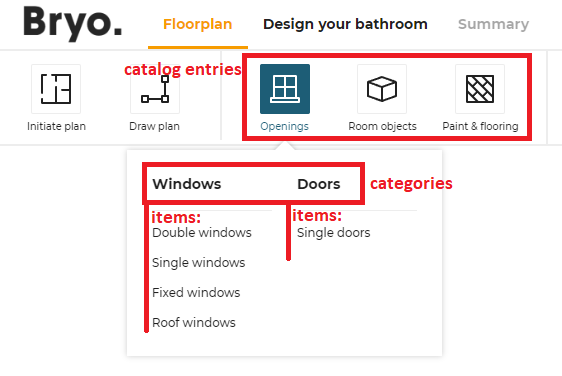
This object is used to configure the different catalog entries that are displayed in the steps of the planner. The illustrations below show the hierarchy of the catalog entries (in the Kitchen Planner).
Catalog entries in the Floorplan context:
Catalog entries in the Design context:
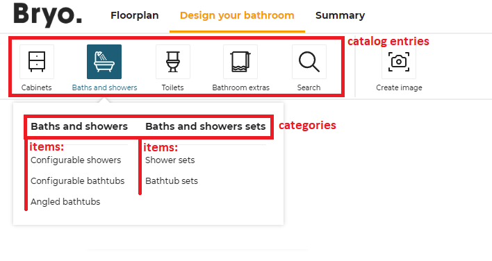
The context will be displayed as tab in the planner. It is not customizable. Then, the structure of data is the following:
- The first level of definition is the catalog entry. Only this level has an icon.
- The second level is the category. It is displayed as menu header in the planner.
- The third level is the sub-level of the menu, i.e. the menu item.
floorplan (context)
    |
    |__ catalogEntry (first level, with picto) e.g.`objects`
    |   |
    |   |__ item (second level) e.g. `columns`
    |   |
    |   |__ item (second level) e.g. `radiators`
    |
    |__ catalogEntry (first level, with picto) e.g. `openings
    |   |
    |   |__ category (second level) e.g. `window`
    |   |   |
    |   |   |__ item (third level) e.g. `simpleWindow`
    |   |   |
    |   |   |__ item (third level) e.g. `doubleWindow`
    |   |
    |   |__ category (second level) `door`
    |   |   |
    |   |   |__ item (third level) e.g. `simpleDoor`
    |   |   |
    |   |   |__ item (third level) e.g. `doubleDoor`
    |   |
detailedDesign (context)
    |   |
    |__ catalogEntry (first level, with picto ) e.g. `cabinets`
    |   |
    |   |__  item (second level) e.g. `baseCabinets`
    |
    |__ catalogEntry (first level) `appliances` (first level)
    |   |
    |   |__ item (second level) e.g. `oven`
    |   |
About the Icons
Each category entry is illustrated by an icon; some icons are fixed and others are customizable.
- In the Kitchen planner: the Cabinets, Appliances, Dining and Kitchen Extras icons are always available.
- In the Home planner: the Iniate Plan, Draw Plan and Water Supply icons are always available.
"Customizable" icons means that you can choose to have them or not.
"Customizable" does not mean that you can add your own icons. The ID of the icons point to an internal file.
📌 The code does not limit the number of icons, but there is a design limit: There is a risk that the pricing and the ceiling height areas block the expansion to the right of the icon area.
The catalogEntries object can contain the keys / pairs below.
Definition of the Context
floorplan
Optional key – Value type: array
Define all possible catalog entries in the floorplan state of the planner.
detailedDesign
Optional key – Value type: array
Define all possible catalog entries in the detailed design state of the planner.
For example:
{
   "catalogEntries": {
      "floorplan": [
         {
            "translationKey": "objects",
            "picto": "objects",
            "categories": [
               {
                  "translationKey": "objects",
                  "categories": [
                     { "translationKey": "columns", "closedTags": [286], "freeTags": [] , "productRank": true}
                  ]
               }
            ]
         },
         {
            "translationKey": "Paint & flooring",
            "picto": "covering",
            "translation": "Paint & Flooring",
            "categories": [
               {
                  "translationKey": "floors",
                  "categories": [
                     { "translationKey": "floorTile", "closedTags": [361], "freeTags": [] , "productRank": true, "translation": "Floor tiles"},
                     { "translationKey": "hardwood", "closedTags": [355], "freeTags": [] , "productRank": true, "translation": "Hardwood"}
                  ],
                  "translation": "Floors"
               },
               {
                  "translationKey": "walls",
                  "translation": "Walls",
                  "categories": [
                     {"translationKey":"paint","translation":"Paint","closedTags":[357],"freeTags": [] , "productRank": true },
                     {"translationKey":"concrete","translation":"Concrete","closedTags":[367],"freeTags": [] , "productRank": true },
                     {"translationKey":"wallpaper","translation":"Wallpaper","closedTags":[356],"freeTags": [] , "productRank": true },
                     {"translationKey":"wallTile","translation":"Wall Tiles","closedTags":[534],"freeTags": [] , "productRank": true }
                  ]
               }
            ]
         },
         {
            "translationKey": "openings",
            "picto": "openings",
            "categories": [
               {
                  "translationKey": "window",
                  "categories": [
                     { "translationKey": "doubleWindow", "closedTags": [], "freeTags": ["double_windows"] , "productRank": true}
                  ]
               },
               {
                  "translationKey": "door",
                  "categories": [
                     { "translationKey": "simpleDoor", "closedTags": [244], "freeTags": [] , "productRank": true},
                     { "translationKey": "doubleDoor", "closedTags": [245], "freeTags": ["double_doors"] , "productRank": true}
                  ]
               }
            ]
         }
      ]
   }
}
Definition of the Catalog Entries
This level is the only one that has pictos.
picto
Mandatory key – Value type: string
The name of the SVG picto that will be used to represent this catalog entry. Supported values are presented in the following table.
| Picto name | Icon |
|---|---|
| accessories-bathroom | |
| showers | |
| toilets | |
| appliances | |
| coverings | |
| deco | |
| dining | |
| doors | |
| flooring | |
| front | |
| furniture-alt | |
| furniture | |
| handles | |
| objects | |
| openings | |
| worktop |
translationKey
Mandatory key – Value type: string
The keys in the translation file corresponding to the translation of the catalog entry. The path to these translation keys is built by the code.
For example
"floorplan": [
   {
      "picto": "objects",
      "translationKey": "objects",
      "closedTags": [286],
      "freeTags": [],
      "productRank": true
   }
]
In this example, the complete translation key that must be in the translation find is:
navigation_catalog.design_room_state.objects
How deep is the key does not impact the final key. A same key can be used at many different levels.
Note: Though
translationKeycan be any string chosen by the range maintainer, some categories and sub-categories have a specific behaviour in the planner, and we use thetranslationKeyto identify them. So for these catalog entries, you must use the exacttranslationKeyas defined in the list below to benefit from the associated behaviours in the bathroom planner:
- For "Openings" category in
floorplan, thetranslationKeymust be "openings". ➡️ See associated behavioursediting wall🔗.- For "Paint & flooring" category in
floorplan, thetranslationKeymust be "covering" and for its sub-categories, thetranslationKeyfor "floors" must be "floors" and thetranslationKeyfor "walls" must be "walls".- For "Cabinets" category in
detailedDesign, thetranslationKeymust be "cabinets". If not, the associated tooltip in the Help Center will not work.- For "Appliances" category in
detailedDesign, thetranslationKeymust be "appliances". If not, the associated tooltip in the Help Center will not work.
categories
Mandatory key – Value type: array
Define in this array all the categories depending on the catalog entry.
isObstacle
Optional key – Value type: boolean
Only for floorplan catalogEntries. All the categories defined under that properties will be consider as an obstacle.
isAccessory
Optional key – Value type: boolean
Only for detailedDesign of catalogEntries. All the categories defined under that property will be considered as accessories.
Definition of the Categories
This level depends on the previous one and will be displayed as a menu in the planner. It is the first level of navigation.
translationKey
Mandatory key – Value type: string
Translation key. See above.
categories
Mandatory key – Value type: array
Define in this array all the subcategories below these categories.
isNonVisibleItem
Optional key – Value type: boolean
All free tags and closed tags defined under this property will be considered as non-visible items and will not have any representation associated with. A customer will be able to add multiple non-visible items via the first tab of the catalog browser and to update and delete them via the "In my project" tab of the catalog browser.
Definition of the Items
The last level is the second level of navigation, i.e. the items in the menu.
translationKey
Mandatory key – Value type: string
Translation key. See above.
closedTags
Mandatory key – Value type: array
List of closed tag IDs that will be searched if the user clicks on that category.
The search made depending of the closedTags is a search of type OR.
For example: In this case, the search will browse all the products having the closedTags 286 OR 128.
{ "translationKey": "columns", "closedTags": [286, 128], "freeTags": [] , "productRank": true}
In this other example, double-clicking "Double Window" will start a search on all the products having the closedTag 252; clicking "Simple Window" will start a search on products having the closedTag 251, etc. But clicking on "Window" will start a search on all the sub-categories, including tags 252, 251 and 256.
 {
   "translationKey": "window",
   "categories": [
         { "translationKey": "doubleWindow", "closedTags": [252], "freeTags": [], "productRank": true },
         { "translationKey": "simpleWindow", "closedTags": [251], "freeTags": [], "productRank": true },
         { "translationKey": "fixedWindow", "closedTags": [256], "freeTags": [], "productRank": true }
   ]
}
freeTags
Mandatory key – Value type: array
List of free tag IDs that will be searched if the user clicks on that category.
The search made depending of the freeTags is a search of type OR. The operation is the same as for the closedTags, except that freeTags are strings while closedTags are integers.
Complete Example
The first translationKey objects in the example below gives the following result in the planner. Only two catalog entries have been generated with one sub-item.
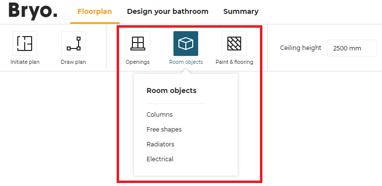
The second translationKey openings has multiple categories in the second level as a result, as illustrated:
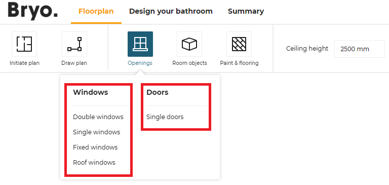
catalogEntries impacts the catalog browser: the browser uses them to browse the catalog. The translationKey windows has 4 categories doubleWindows, singleWindows, fixedWindows and roofWindows that are displayed in the planner, as illustrated:
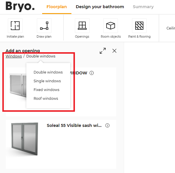
"floorplan": [
   {
      "translationKey": "openings",
      "picto": "openings",
      "categories": [
         {
            "translationKey": "window",
            "categories": [
               { "translationKey": "doubleWindow", "freeTags": [], "closedTags": [ 252 ], "productRank": true },
               { "translationKey": "simpleWindow", "freeTags": [], "closedTags": [ 251 ], "productRank": true },
               { "translationKey": "fixedWindow", "freeTags": [], "closedTags": [ 256 ], "productRank": true },
               { "translationKey": "roofWindow", "freeTags": [], "closedTags": [ 573 ], "productRank": true },
            ]
         },
         {
            "translationKey": "door",
            "categories": [
               { "translationKey": "simpleDoor", "freeTags": [], "closedTags": [ 244 ], "productRank": true },
            ]
         }
      ]
   },
]
commercialDimensionParameter
Optional key – Value type: string
ID of the parameter that represents the commercial dimensions of the product. Refer to Set Up the Product Card for display of this parameter in the product card.
aggregationsParameter
Optional key – Value type: array
List of all parameter IDs that will be used by the application as catalog filters.
➡️ See the Parameter Dictionary 🔗 for the complete list of these parameters.
{
   "aggregationsParameter": [
      "commercialDepth",
      "commercialWidth",
      "function",
      "worktopType",
      "worktopThickness",
      "worktopMaterial"
   ],
}
textualFieldAvailable
Optional key – Value type: boolean
Defines if a text input field will be available for edition. By default the value is set to "true". If set to false, this will remove the manual notes and the text field where the user can enter a description of her/his project.
allowMeasureService
Optional key – Value type: boolean
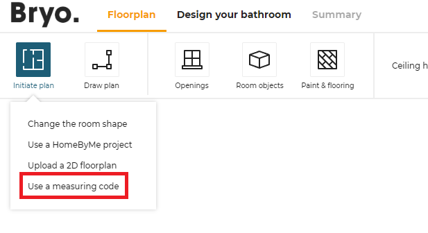
Defines whether the measure service will be enabled or disabled. By default the value is set to "false".
If set to true, the measure service is displayed to the user in the Initiate Plan menu.
hideComposeProduct
Optional key – Value type: boolean
Defines the cabinet editor availability for the application distribution. By default the value is set to "false", the cabinet editor is available. If set to "true" the "Modify" button in the edit panel of the cabinets is not displayed and it is not possible to modify a cabinet with cabinet editor.
hideComposeProductPrice
Optional key – Value type: boolean
Defines whether the price in cabinet editor is available. By default the value is set to "false", the price in cabinet editor is displayed. if set to "true" the price in cabinet editor is not displayed.
defaultWallMaterialID
Mandatory key – Value type: string
Define the wall material that will be used by default when the application launches. For example:
"defaultWallMaterialID": "4755",
defaultFloorMaterialID
Mandatory key – Value type: string
Defines the floor material that will be used by default when the application launches. For example:
"defaultFloorMaterialID": "4296"
defaultProject
Optional key – Value type: object
Defines all the default project that can be overrided. There are three default projects:
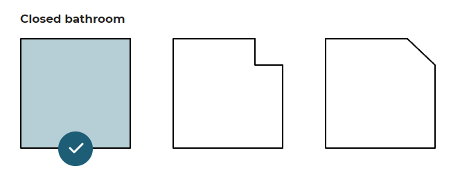
❗ It is highly recommended that you implement all the possible default projects, even if they will not be used. Their availability in the planner is built dynamically; if they are not specified in the JSON, they will not be visible and appear greyed out. Instead of one the three possible plans, the choice will be limited to a plan with walls.
Code to Copy and Paste
📌 We recommend that you copy and paste the sample code below in order to ensure the integration of your default project.
"defaultProject": {
   "closedKitchen1": "closedKitchen1",
   "closedKitchen2": "closedKitchen2",
   "closedKitchen3": "closedKitchen3"
},
➡️ Please read Create a default project for complementary information.
This setting object supports the keys / pairs below.
closedKitchen1
Optional key – Value type: string
The value is the name of the project saved as default project. If the value is not specified, a default project from the application will be used.
📌 There is only one possible value:
closedKitchen1.
closedKitchen2
Optional key – Value type: string
The value is the name of the project saved as default project. If the value is not specified, a default project from the application will be used.
📌 There is only one possible value:
closedKitchen2.
closedKitchen3
Optional key – Value type: string The value is the name of the project saved as default project. If the value is not specified, a default project from the applictaion will be used.
📌 There is only one possible value:
closedKitchen3.
hqRendering
Optional key – Value type: object
This parameter controls the HQ rendering feature of the application:
- A choice between a high or a low image resolution
- The possibility to enable or disable the HQ rendering availability.
By default, application will provide the HQ rendering feature with High quality images (the image resolution is "1920X1080"). The user can change the quality of the image by changing its resolution to the value of "640x360".
The object can contain the keys / pairs below.
isEnabled
Optional key – Value type: boolean
Defines the HQ rendering availability in the application to take realistic images of the bathroom. By default, the value is set to "true" so that HQ rendering will be enabled by default. Set to "false" if the user does not want HQ rendering.
imageResolution
Optional key – Value type: string
Defines the image quality/resolution for the HQ rendered images generated. Possible values are:
- "1920x1080"; this is the default, high value.
- "640x360"; this is the "low" resolution.
Example Example with HQ rendering enabled and the default value:
"hqRendering": {
        "isEnabled": true,
        "imageResolution": "1920x1080"
    }
Example with HQ rendering enabled and the other possible value:
"hqRendering": {
        "isEnabled": true,
        "imageResolution": "640x360 "
    }
Example where the HQ rendering is disabled:
"hqRendering": {
        "isEnabled": false
    }
hidePanoramicRendering
Optional key – Value type: boolean
Used to indicate the render 360 availability in the application. By default, the value is set to true so that Render 360 will be de-active by default. Set to false if user wants Render 360.
For example
"hidePanoramicRendering": true
hideProceed
Optional key – Value type: boolean
For some Kitchen Retailers, according to their requirements, the Proceed button displayed at step 4 should be disabled. The hideProceed parameter is used to enable/disable this button, as illustrated below.
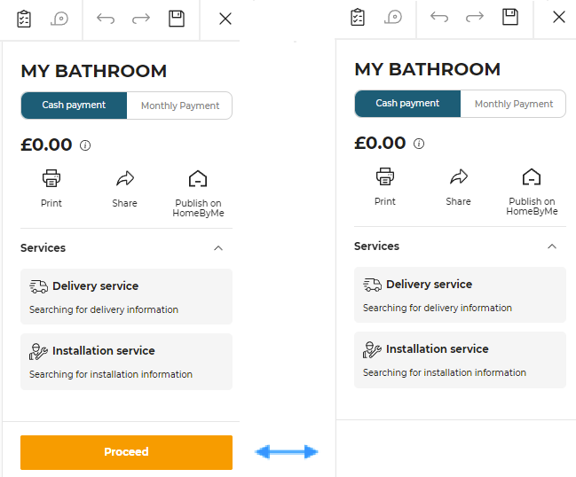
Defines whether the proceed button should be disabled. By default the value is set to "false" so that the button is available.
searchSortLocale
Optional key – Value type: string
In the catalog of a products, some retailers rank the products according to their requirements.
This searchSortLocale parameter is used to enable/disable the product ranks.
See Product Rank for catalog search 🔗 for detailed information on product ranking.
Defines the sorted locale that will be used for sorting lexicographical order. By default, if not specified, the lexicographical order will use Unicode characters for sorting. Therefore, the order will be the same in any language context.
Possible values are:
- "locale": The value is the same locale that the one defined in application distribution parameters. For example: If the locale defined for planner is "ru-RU", setting the value to "locale" means to use the Russian alphabet to sort. If the locale is "de-DE", it will use the German alphabet to sort.
- A given locale that is combination of a mandatory and an optional element:
- MANDATORY: 2-letter code of a language, following 🔗 ISO 639-1.
- OPTIONAL: 2-letter code of a region / country, following 🔗 ISO 3166-1.
❗ Currently, "sv-SE" is the only locale supported as "given locale" value.
defaultWorktopOverhang
Optional key – Value type: object
This object is used to define the default overhang values for the left, right, front and back sides of worktops.
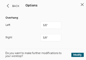
Below are detailed the possible parameters that you can add in this configuration object.
Note that each attribute is optional, and then table below indicates the value used if the attribute is not declared in the settings.
| Attribute | Value if not specified | Description |
|---|---|---|
| left | 15 | The default dimension of left worktop overhangs in mm |
| right | 15 | The default dimension of right worktop overhangs in mm |
| front | 35 | The default dimension of front worktop overhangs in mm |
| back | 15 | The default dimension of back worktop overhangs in mm |
| addBackCoverPanel | false | When set to true, the back cover-panel thickness is added to the default back overhang value |
| withLeftCover | -1 | Additional overhang that is added on the left side when there is a cover panel on the left. If the value is -1, the real thickness of the cover panel is used for this value |
| withRightCover | -1 | Additional overhang that is added on the right side when there is a cover panel on the right. If the value is -1, the real thickness of the cover panel is used for this value |
Example
"defaultWorktopOverhang" : {
   "left" : 15,
   "right" : 15,
   "front" : 35,
   "back" : 15,
   "addBackCoverPanel": true,
   "withLeftCover" : 15,
   "withRightCover" : 15
}
waterfallInset
Optional key – Value type: object
This object is used to define the waterfall inset on each side for "straight" waterfall worktops, and as an overhang. Does not consider "angled" as a value of waterfallType as this worktop parameter cannot be used with inset.
Below are detailed the possible parameters that you can add in this configuration object.
Note that each attribute is optional, and then table below indicates the value used if the attribute is not declared in the settings.
| Attribute | Value if not specified | Description |
|---|---|---|
| fromWorktopEnd | 3 | The overhang of the worktop and waterfall in mm |
| fromWorktopFront | 3 | The inset from the front edge of the worktop in mm when cabinet is touching a wall. Also used from the worktop back, when cabinet is not touching a wall |
Example
"waterfallInset" : {
   "fromWorktopEnd" : 3,
   "fromWorktopFront" : 1
}
plan2DAvailable
Optional key – Value type: boolean
Defines whether the generation of 2D plans is available or not. By default, the value is set to 'true'.
allowSharing
Optional key – Value type: boolean
Defines if the "Share" button in summary step is available. By default, value is set to 'false'.
allowDelivery
Optional key – Value type: boolean
Defines if the "Delivery date and price" in summary step is displayed. By default, value is set to 'false'.
allowInstallation
Optional key – Value type: boolean
Defines if the "Installation date and price" in summary step is displayed. By default, value is set to 'false'.
allowGuidedTour
Optional key – Value type: boolean
Defines if the guided tour is available for the user in step 1. By default, value is set to 'false'.
allowFrontEdge
Optional key – Value type: boolean
The "Front" option in edge material reference in Worktop Editor will be controlled with the help of this parameter. By default, value is set to 'true'.
summaryModules
The summaryModules is used to configure the custom modules in Summary step. It is an optional key so if you don't need any custom modules in Summary step you can ignore this parameter.
It contains the keys/values mentioned below.
priceDetail
Optional key – Value type: boolean
Defines if the "Price Detail" module in the Summary step is activated or not. The default value is "false", which indicates this custom module will not be activated.
servicesInfo
Optional key – Value type: boolean
Defines if the "Services" module in the Summary step is activated or not. The default value is "false", which indicates this custom module will not be activated.
standardModules
The standardModules is used to configure the custom modules in the application. It is an optional key so if you don't need any custom modules in application you can ignore this parameter.
It contains the keys/values mentioned below.
images2DPlans
Optional key – Value type: boolean
Defines if the "Show images" button in the Summary step uses the standard module 'Medias' or not. The default value is "false", which indicates this custom module will not be activated.
productSheet
Optional key – Value type: boolean
Defines if the product sheet pop-in uses the standard module 'productSheet' or not. The default value is "false", which indicates this custom module will not be activated.
shareProject
Optional key – Value type: object
Defines if the "Share" button in the Summary step uses the standard module 'Share Project' or not. The default value is "null", which indicates this custom module will not be activated.
ecoFee
Optional key – Value type: boolean
Defines if the ecoFee pop-in uses the standard module 'ecoFee' or not. The default value is "false", which indicates this custom module will not be activated.
projectPriceInfo
Optional key – Value type: boolean
Defines if the project price info icon (i) in the step 2 - pick a layout, step 3 - design your bathroom, and step 4 - summary uses the standard module 'priceInfo' or not. The default value is "false", which indicates this custom module will not be activated.
editorPriceInfo
Optional key – Value type: boolean
Defines if the price info icon (i) in the editor, used in worktop editor, wall panel editor, wall edge strip editor, and cabinet editor uses the standard module 'priceInfo' or not. The default value is "false", which indicates this custom module will not be activated.
allowAdditionalHelp
Optional key – Value type: boolean
Defines if the additional help is available for the user in help center. By default, value is set to 'false'.
enableFavorites
Optional key – Value type: boolean
Defines if the favorites is available for the user in step 3. By default, value is set to 'false'.
resetCustomizedLinear
Optional key – Value type: boolean
Defines if the customized worktop/wallpanel is reset when changing to a different product. By default, value is set to 'true'.
This parameter should only be used for simple worktop catalogues where, for example, edgeCompatibility is the same for all worktops or wall panels.
hideItemList
Optional key – Value type: boolean
Controls if the Item list icon is disabled or not. By default, the value is set to 'false'.
hidePrint
Optional key – Value type: boolean
Controls if the Save & Print icon is disabled or not. By default, the value is set to 'false'.
